Markdown as Playing Cards
Why scroll through walls of text when you can flip through a deck of cards? In this post, we’ll transform standard markdown elements into interactive playing cards.
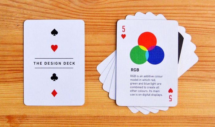
The Deck
Here is a collection of “cards” representing different types of content. Hover over (or tap) the cards to see the flip effect!
K ♥
The Suicide King
K ♥
The King
Advanced Cards
We can even put complex content like diagrams and equations inside these cards.
How to Use
Simply import the PlayingCard component and wrap your markdown content.
<PlayingCard rank="A" suit="spades" flip={true}>
  # Your Content Here
</PlayingCard>
Props
| Prop | Description | Default |
|---|---|---|
rank | The card rank (A, K, Q, J, 10…) | "" |
suit | The card suit (spades, hearts…) | "none" |
flip | Enable flip animation on hover | false |
backContent | Text to show on the back | "SimpleAryan" |
animation | On-scroll animation type | "fade-up" |
Design Philosophy
This design mimics the classic poker card aesthetic:
- Rounded Corners:
border-radius: 1remgives that smooth feel. - Aspect Ratio:
2.5/3.5maintains the traditional shape. - Corner Indices: Absolute positioning places the rank and suit in the corners.
- Flip Animation: CSS 3D transforms (
rotateY) create the realistic flip effect.
Go ahead, build your own deck of knowledge!